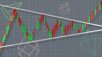

Trading can be a very daunting task for beginners. There are so many things to learn, which can be overwhelming at first. However, there are a few tools that can help. One of the prominent analysis tools is candlestick chart patterns. Candlestick patterns are a technical tool traders use to decipher market conditions and make better informed trading decisions. Candlestick charts originated in Japan, so they are sometimes referred to as Japanese candlestick patterns.
In this blog post, we will explain what candlestick patterns are, how many candlestick patterns are there and how you can learn candlestick pattern analysis to improve your trading results.
What are Candlestick patterns?
Traders have used Candlestick patterns for a long time to analyze the markets. These patterns can be used to identify potential reversals, breakouts and continuations.
The 35 powerful candlestick patterns are formations that occur on candlestick charts. These charts are created by plotting the price action of an asset over a certain period of time. The interpretation of candlestick patterns is based on the assumption that the market is efficient and that prices move in trends.
The candlesticks themselves provide important information about the open, high, low and close prices for each period. The patterns that form can give traders clues about the direction of the market.
How to Read a Candlestick Pattern?
The daily candlestick provides market data, including the opening, high, low, and closing (OHLC) prices. The OHLC is represented by the rectangular body, which is coloured red or black to signal a drop in price and green or white for a rise in price. The lines above and below the body are commonly called wicks or tails and indicate the day’s maximum highs and lows. When taken together, all parts of the candlestick can predict changes in market direction or pinpoint potential moves that should be confirmed with the next day’s candle data.
Difference Between Foreign Exchange (FX) Candles and Other Markets’ Candles
Candlestick charts are a staple for technical analysts across all sorts of markets, including foreign exchange (FX). But FX candles are different from other markets’ candles. How? Let’s take a look…
The foreign exchange market never sleeps, so the trading day technically never ends. As a result, there are rarely any gaps in price patterns on FX charts. The only time an FX candle can exhibit a gap is over a weekend when the Friday close is different from the Monday open.
Candlestick patterns generally use price gaps to communicate their message. It can be challenging to spot a potential candlestick signal on an FX chart because they don’t always follow the traditional formation. For example, the figure below shows a bearish engulfing line where the body does not completely envelope the previous day’s body, but only the upper wick does. With some imagination and creativity, you will start to see these signals forming, even if they aren’t textbook in nature.

Examples of Candlestick Patterns
There are numerous candlestick patterns that traders can use to try and gauge future price movements. Some of the top and more commonly used candlestick patterns include:
Doji and Spinning Top
The Doji is a candlestick pattern that indicates indecision or a tug of war between buyers and sellers. A Doji candlestick forms when the open and close are equal (or very close to each other).
The Spinning Top candlestick also has a small body with upper and lower shadows that extend well above and below the actual body. The upper shadow is the candlestick’s highest price, and the lower shadow is its lowest price. A Spinning Top indicates a close near the high or low of the period, but it doesn’t provide direction like a Doji does.
Bullish/Bearish Engulfing Lines
The bullish engulfing line is a candlestick pattern that forms at the end of a down trend. It consists of a small black candlestick followed by a large white candlestick that “engulfs” the small black one. The bearish engulfing line chart pattern is just the opposite, consisting of a small white candlestick followed by a large black candlestick.
The bullish engulfing line is a two-candlestick pattern, so it requires some prior price action to confirm its validity. For example, you might see a bearish trend leading up to the pattern, with the small black candlestick representing a continuation of that trend. The large white candlestick then signals a potential reversal.
The bearish engulfing line can also be used to confirm a reversal from an uptrend to a downtrend. In this case, you would look for a small white candlestick representing a continuation of the uptrend, followed by a large black candlestick signalling the potential for a reversal.
Hammer
The presence of a hammer in candlestick pattern can be an indicator that the downtrend may soon be coming to an end. This is seen with the long lower tail, which shows that sellers made another attempt to push prices lower but were ultimately unsuccessful. The key here is that this marks the first time buyers have surfaced in some time, suggesting a sentiment change among investors. This pattern receives confirmation with a bullish candle appearing on the following day.
Hanging Man
The hanging man pattern is a potential indicator of an impending reversal lower and is the opposite of the bullish hammer formation. In other words, where the latter suggests that selling interest is entering the market and leading to a long tail on the downside, The former hanging man pattern tells us that buyers fought back against what was presumably stronger selling pressure throughout much of the day. Confirmation of future topping action would come with a down candle the following day.
Abandoned Baby Top/Bottom
An abandoned baby top is created when there is a sharp, one-day rally in the midst of a downtrend. The day following this sharp rally should be a “gap down”, meaning that the price opened lower than it closed the previous day. This gap down effectively “abandon’s” the new high made during the sharp rally, hence the name of the pattern.
The abandoned baby bottom is just the opposite, forming an uptrend with a sharp, one-day sell-off followed by a “gap up” the next day. This gap higher effectively “abandon’s” the new low made during the sharp sell-off, hence the name of the pattern.
Both of these patterns are considered to be reversal patterns, with the abandoned baby top signalling a potential reversal from an uptrend to down trend and the abandoned baby bottom signalling a potential reversal from a downtrend to an uptrend.
The 15 minute Candlestick pattern
The 15 minute candlestick chart is a tool that can be used to help traders identify potential trading opportunities. This chart shows the open, high, low, and close for each 15-minute period. The candlesticks can be used to identify trends, support and resistance levels, and reversals. In addition, the chart can be used to generate buy and sell signals. The 15-minute candlestick chart is a valuable tool for any trader who wants to improve their trading results.
Intraday Candlestick Patterns
There are a few things to keep in mind when using candlestick patterns for intraday trading. First, it’s important to use patterns that are relatively easy to identify. Second, you want to ensure that the pattern is formed on a significant level of support or resistance. Finally, you want to make sure that there is a clear path of least resistance for the price to move in the direction of the pattern.
Bullish & Bearish Candlestick Patterns
Bullish candlestick patterns form when the open price is lower than the close price, and can be used to indicate that prices are likely to continue rising. There are many different bullish candlestick patterns, each with its own interpretation. Some of the more common bullish patterns are the hammer, engulfing pattern, and morning star.
Bearish candlestick chart patterns are reversal patterns that occur at the top of an uptrend. These patterns form when the market is overbought and due for a correction.The 3 most common bearish reversal candlestick patterns are the Evening Star, the Bearish Engulfing Pattern, and the Shooting Star.
Take Special Note of Long Tails and Small Bodies
When you’re looking at candlestick charts, it’s important to take note of any long tails or small bodies that form. Long tails show that there is significant interest in a particular price level, while small bodies show that there is very little difference between the open and close of the period.
For example, a long-tailed candlestick might form when there is a sharp sell-off followed by a rapid rally back to the original price level. This could signal that buyers are willing to step in and support the stock at this price level, which could lead to further upside in the future.
Conversely, a small-bodied candlestick might form when there is very little price movement over the course of the period. This could signal that investors are undecided about the stock, which could lead to further consolidation in the future.
Candlestick Pattern FAQs
Which candlestick pattern is most reliable?
The answer to this question is difficult as there are many candlestick patterns, and they all have different levels of reliability. Some of the most commonly used and best candlestick patterns include the hammer, shooting star, engulfing pattern, and morning/evening star.
Does candlestick pattern analysis really work?
Candle chart analysis is a widely used and accepted method of technical analysis. While there is no guarantee that every candlestick pattern will work perfectly, it is still a reliable method that can be used to make informed decisions about trading.
How do you read a candle pattern?
There are a few things to look for when reading a candlestick chart. First, you will want to identify the type of pattern it is. There are many different types of candlestick patterns, so understanding all candlestick patterns will take some practice. Once you have identified the pattern, you will want to look at the candle’s open and close prices, as well as the highs and lows. This will give you an idea of how strong the pattern is and whether or not it is likely to continue.
The Bottom Line
Candlesticks are popular among traders because they tell a story of the battle between buyers and sellers. A light candle usually means that the buyers have won, while a dark candle signifies that the sellers have prevailed. By looking at candlesticks, you can get an idea of what happens in between the open and close, and who is winning each battle.With the help of the candlestick patterns, stock traders can take trading decisions like when to enter or exit the stock by analyzing them in the technical charts.
Different types of candlestick patterns can be helpful for trading, but investors should remember that they should not be used in isolation. Instead, candlestick patterns should be used in conjunction with other technical indicators to confirm trading signals and help you make more informed decisions about when to buy and sell stocks.


